I was the UX designer for the PayNearMe website redesign.

UX Challenge 1
Establish a Flow to Align New Business Goals
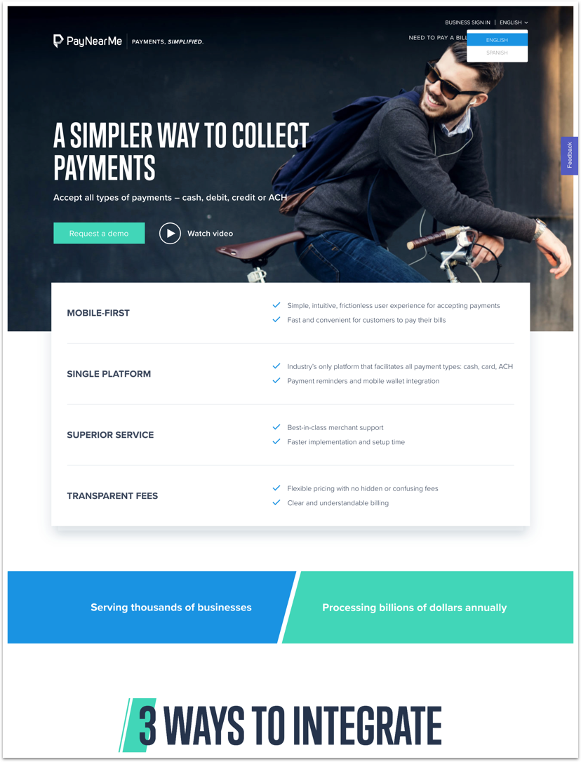
A main business goal was to prioritize “Paynearme for Business”. This was a challenge because it was a different goal for the user’s arriving on their original site. In order to create the smoothest change, I tested two flows with a rapid prototype and test.

Early flow sketches for 2 versions. “Pick Your Path” and “Single Page”
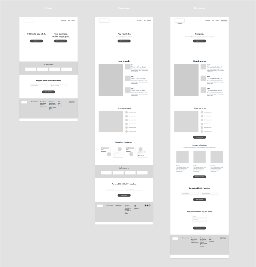
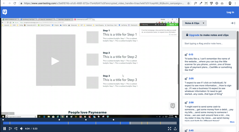
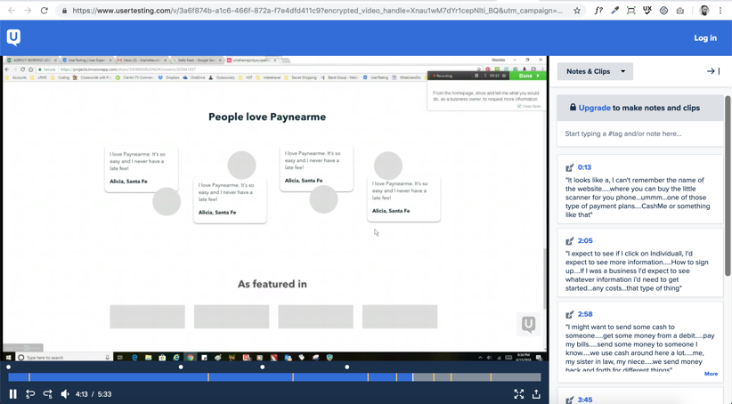
Initial Sketches, Wireframes & Usertest
Based on the 2 flow options, I created sketches, wireframes and did an initial usertest on usertesting.com

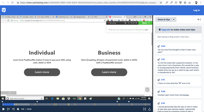
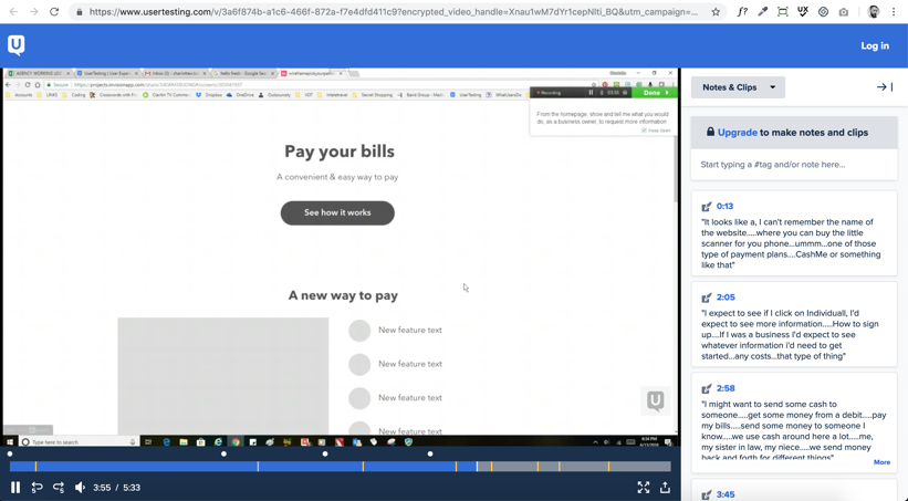
User Testing Insights & Solution
In the “Pick Your Path” flow, 60% of users were confused about how the Business & Individual products differed.
This flow added an average time of 45 seconds to complete the task of “Request a Demo” compared to the single page flow.

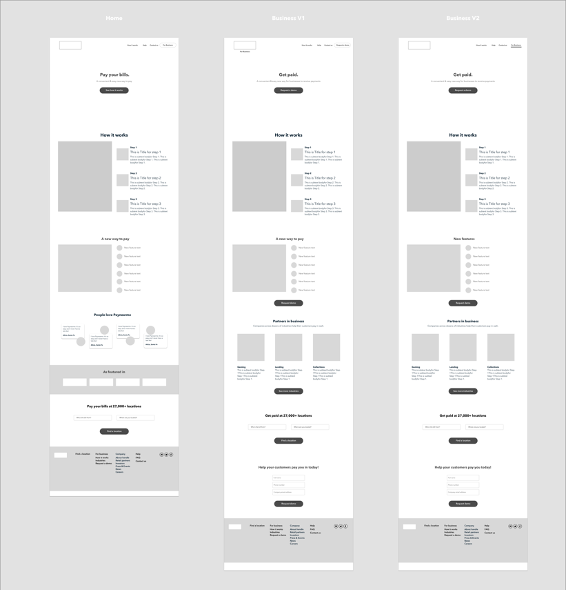
Final version of the new Paynearme sitemap.
UX Challenge 2
Clear Communication of Product Offerings
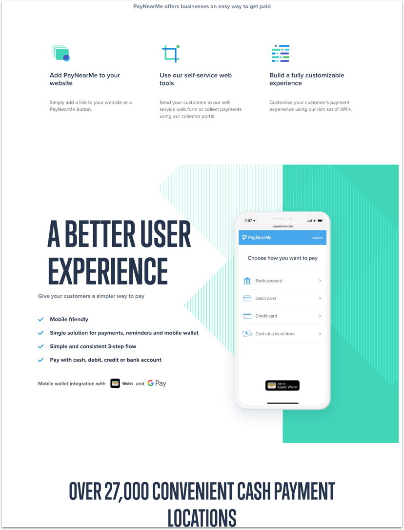
Clear communication was a huge part of the user experience when exploring the site. I worked closely with the Product Manager for the UX Writing/copywriting of the site to create a transparent and clear message. It was tested and iterated on based upon user feedback.
Prioritizing the hierarchy of CTA’s: “Request a Demo” CTA was brought front and center, while “Search for a Location” was moved to exist within the “Individual” user’s page.
UX Challenge 3
Designing a Cohesive Visual Identity
PayNearMe website before redesign

I curated a new archive of photography and created a moodboard to express a cleaner more modern look and feel for the brand.

Early moodboard & inspiration.