MIRROR
A clothing retailer's digital transformation.

Overview
Mirror is a clothing company that has 400 stores in 32 countries. Their motto is Clothing for Everyone. They value inexpensive clothing that looks great. They have been resistant to develop an ecommerce website and digital presence because they value their physical relationship to their consumer. My challenge was to create an responsive ecommerce website and digital experience and new visual identity for the brand.
The Research
Through my research of competitive analysis, surveys, interviews, and observations I was able to connect and gain empathy with their customer.


An easy checkout and free or inexpensive shipping will be a deciding factor on whether the user decides to make the purchase.
Information Architecture
Mirror has a large inventory of clothing catering to a global audience. There was an initial need to structure the presentation of products and information. I wanted to create a website that was clear and easy to navigate while searching products and filtering colors, sizes, and styles.


Sketches & Wireframes
First, I sketched the wireframes on paper and then I created low fidelity wireframes in Sketch.


Prototype & Usability Test
Then, I created a prototype and conducted a usability test through Invision to find the user’s pains and successes while buying a product.

Key Insights
Some of the initial design discoveries during the usability test was a need for clarification of sizing and the ability to edit the customer’s cart throughout the checkout process.
Because over 70% of their user’s shop online using their smartphone, responsive design was a priority. It had to be a cohesive shopping experience moving between devices.
Branding & Visual Identity

I created a wordmark that updated their visual identity.
While my process started with many iterations of possible logos and concepts, after various stakeholder meetings we decided on a strong neutral wordmark that was based in balanced space and a perfect circle. It’s simple, modern and neutral.
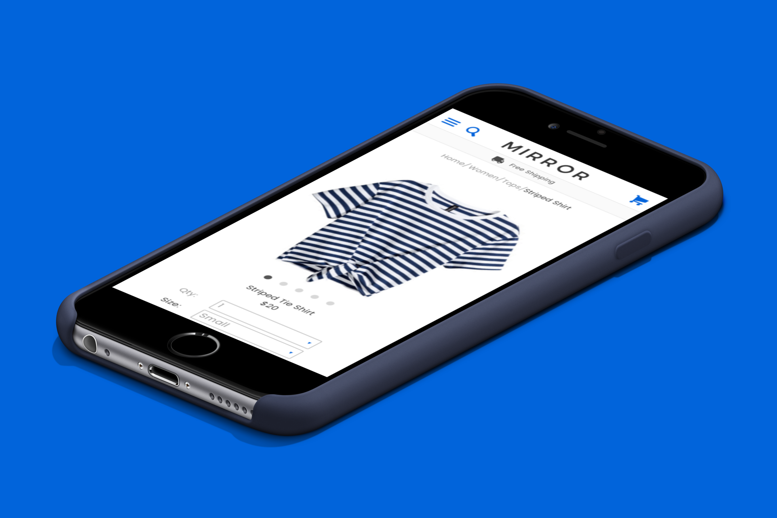
UI Design
The product is a responsive ecommerce experience that is easy to navigate and visually pleasing.
The website relies heavily on whitespace, a modular design, and information hierarchy. The design will continue to be iterated and tested to discover better ways to create the best user experience for the customer.